
ChatGPT as Creative Director, Claude as Build Team: A Website in Hours
We built the Nero Studio website, from catalogue PDF to brand strategy, cinematic imagery, an Astro build, browser testing and motion design, in a few hours rather than the weeks it would traditionally take. ChatGPT worked as the creative studio and Claude Code as the production team. This is what each one did, what it caught that we hadn't asked for, and why the speed didn't cost us an understanding of the code.
 Willan Theunissen · 12 November 2026

The brief: a catalogue, a logo and no website
Nero Studio is a new premium automotive accessories business in Rivonia, Sandton. It handed us a 24-page Signature Collection 2026 catalogue with 52 products across two vehicles, the Jetour T2 and iCAR V23, plus its corporate identity. It needed a single-page brochure website that would establish the brand and generate qualified enquiries. E-commerce could come later.
On a traditional timeline, that’s weeks of work: a strategy workshop, a product photography shoot or stock search, a design round, a build, then testing and revisions. We did it in a few hours. The finished site is in our portfolio.
The speed isn’t the interesting part, though. Plenty of tools will generate a website in minutes. What matters is that the result is a real codebase we can explain, maintain and extend, built on decisions we made and checked. Here’s how the work split between the two AI tools, and where our judgement came in.
Two tools, two jobs
We gave each tool the job it’s best at and kept the handover between them explicit.
- ChatGPT was the creative studio: brand positioning, product categories, the first development brief and every generated image.
- Claude Code was the production team: it worked directly in the project folder, reading the PDF, the brief, the images and the code, then building, running, screenshotting and fixing the site itself.
That second point is the difference between an AI chat assistant and an AI agent. We weren’t copying snippets out of a chat window and pasting them into files. Claude read the actual source material and wrote the actual files, then tested its own work in a browser before reporting back.
Phase one: strategy before any code
We started with ChatGPT and the catalogue, not a website template. Rather than present Nero Studio as a parts importer, we repositioned it as a premium customisation and lifestyle brand with three commercial pillars: curated accessories, coordinated Signature Builds, and a future boutique experience.
The supplier’s catalogue categories became six collections a buyer would recognise: Exterior Styling & Body Kits, Roof Systems & Cargo, Adventure & Overlanding, Lighting & Electronics, Wheels & Finishing, and Protection & Utility. Two more, Interior & Lifestyle and Performance & Capability, were parked as future expansion.
We also decided what not to build. Payments, stock management and checkout were left out on purpose. A new brand needs to be understood and trusted before it needs a basket, and a brochure site with a good enquiry flow gets there faster with far less to maintain.
Phase two: art direction by prompt
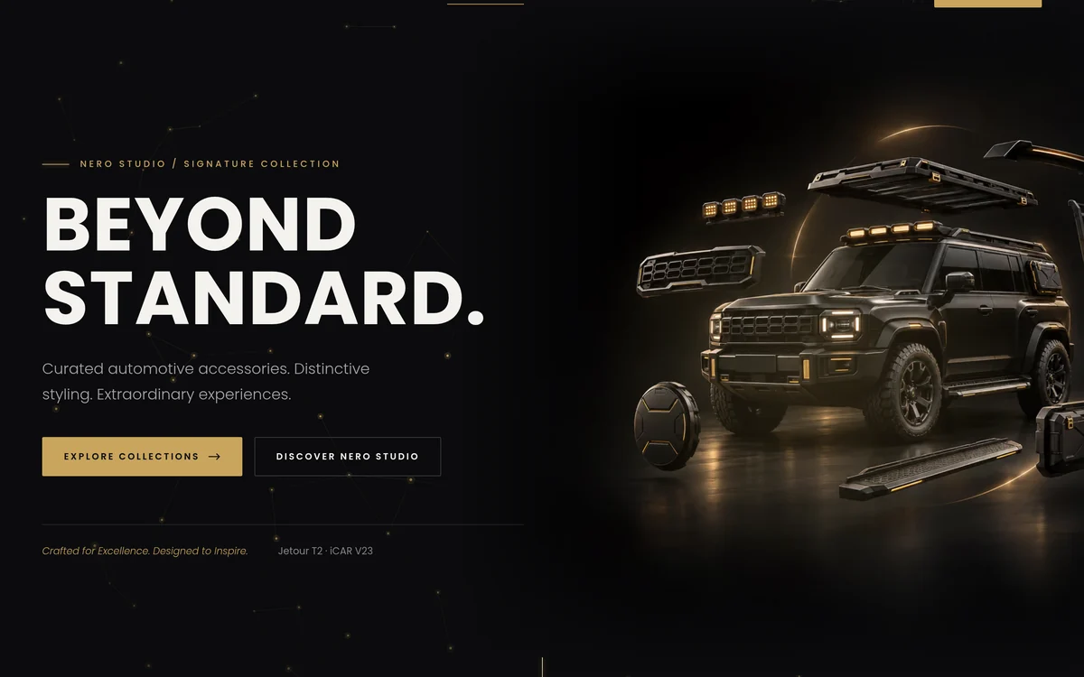
The imagery came from ChatGPT, through many rounds of prompting. The look we settled on was photorealistic automotive CGI: matte-black vehicles, accessories floating in an exploded view, dark studio sets, champagne-gold rim light, haze and reflections.
The most important constraint wasn’t aesthetic. Every image had to work as a website asset, not as artwork on its own. That meant composing the vehicle and products to the right and keeping a dark, quiet area on the left where an HTML headline and button would sit. The first category image didn’t land the floating-parts concept. It only became obvious once the image sat inside a real component, which is why we reviewed images in the layout rather than in isolation.
We ended up with a hero, six collection backgrounds, four Signature Build images (Urban, Explorer, Overland and Signature) and a boutique showroom render. We didn’t need a studio shoot for any of them.
Phase three: seven short prompts to a working site
Then Claude Code took over. The build took about 45 minutes of wall-clock time in a single session, driven by seven prompts. Here they are, exactly as typed:
- “Review my PDF, and than take my brief and update it. Also prepare the product extraction for the PDF and construct and SVG logo that matches the PDF”
- “I also want this brief to build the site into a github pages repo”
- “I am happy with this. Let’s build the site.”
- “Protection & Utility image is not working”
- “I feel this lacks animation to make it premium, client likes shimmer and connected dots, also add animated neon lights, in the brands colours as borders, should really feel like a moving breathing page with micro interactions and scroll actions”
- “can you add [Luxury Jetour SUV Showroom.png] to More than accessories. An experience., on the right handside”
- “we can also maybe add a logo animation, maybe the O of Nero doing a glimmer effect, but it should be infrequent. Button animation feels tacky like it is gold, instead do a neon glow shadow effect with these”
None of these is a carefully engineered prompt. They’re one or two casual sentences, some with typos, and three of them were queued while Claude was still working on the previous one. The precision came from the context in the folder, meaning the PDF, the brief, the images and the code, not from the wording.
What the first prompt produced
From that first request, Claude read all 24 pages of the catalogue and came back with four things.
Brand tokens measured from the source. It sampled the colours from the PDF instead of guessing, correcting the gold to #C9A55C. It noticed the catalogue was set entirely in Poppins and replaced the fonts the brief had suggested.
Structured product data. It extracted all 52 product images and matched them to SKUs. A build script now produces one product data file that maps every item to a vehicle and a collection. That file drives the whole catalogue, so updating a product means changing data, not editing HTML.
A rebuilt logo. It reconstructed the logo and wordmark as clean SVGs in dark, light and mono variants plus a favicon, and checked the renders against the catalogue cover.
A catalogue review nobody asked for. This turned out to be one of the most valuable outputs. Nearly half the products (24 of 52) carried at least one flag:
- Trademark exposure: product names using another manufacturer’s protected names, and a product photo showing a third-party brand’s logo. That product was held back from publication.
- Internal data in a customer document: supplier order quantities printed in the catalogue, which were stripped out before anything reached the page.
- Compliance questions: roadworthiness considerations on lighting, wheel spacers and tow bars.
- Missing basics: no contact details anywhere in the catalogue, so the enquiry form had no confirmed destination, and a vehicle brand spelled differently from how it’s sold in South Africa.
- Data errors: a mis-coded category, ambiguous sizes, duplicate product names and 18 products without a description.
Every one of these would have become a real problem after launch. A human reviewer might have caught some of them. An agent reading every page against the brief caught all of them in minutes and recorded each flag against the product it applied to.
Phase four: a build that tests itself
After “Let’s build the site”, Claude scaffolded the whole thing in Astro with Bootstrap 5 and custom SCSS:
- Eight page sections in the order the brief set out, plus privacy, 404 and robots pages
- A typed data layer for settings, collections, vehicles, products and builds, with internal notes stripped at build time
- A catalogue that filters by vehicle and collection, where “Enquire” on any product pre-fills the enquiry form
- A form with a hidden anti-spam field, a privacy notice, an unticked marketing opt-in and a configurable endpoint
- Canonical URLs, social tags, structured data and a sitemap
- Responsive AVIF and WebP images, which took the hero from 1.4 MB to 8–64 KB depending on screen size
- GitHub Actions for CI and deployment that work on a sub-path or a custom domain
It didn’t stop when the build passed. Claude ran the type checker, opened the site in headless Chrome, screenshotted it at desktop and mobile widths, and clicked through the filters, form pre-fill, validation, a mocked submission and the mobile menu. It found and fixed five bugs on its own: an entrance animation that cancelled the hero’s centring, a mobile menu that collapsed into the header, a phone-validation pattern that newer Chrome rejected, a low-contrast button caused by a CSS specificity clash, and product overlays colliding with photos. It also confirmed that none of the internal order data or review notes appeared in the built HTML.
Phase five: where the two tools met
When we reported “Protection & Utility image is not working”, Claude inspected the file rather than the code. The image named “Protection & Utility” actually showed wheel covers, so it had already moved it to the Wheels & Finishing tile.
Then it wrote a brief for the image generator: exact dimensions (1672 × 941), the series style, a dark left third for the text, and the products this category really contains, namely side steps, tow hitch, snorkel and side armour. The regenerated image came back from ChatGPT, and Claude checked it against that brief before wiring it in.
That loop is the real workflow. The creative side makes assets, the production side tests them in context and sends back a precise brief when something doesn’t fit, and the work converges in a couple of passes instead of a week of email.
Pushing back on the brief, then delivering it properly
The original brief ruled out neon, particles and heavy motion. Then the client asked for shimmer, connected dots and “a moving breathing page”. Claude pointed out that this contradicted the brief, updated the brief to record the change of direction, and set guard-rails before building anything:
- Every effect stays in the brand’s gold.
- Animations pause when they’re off-screen or the tab is hidden.
- Visitors who have reduced motion switched on get a fully static page.
Within those rules it added a cursor-reactive constellation behind the hero, neon light tracing card borders and the enquiry form, word-by-word heading reveals, image wipes, parallax, a scroll progress line and magnetic buttons. When we said the gold button sheen felt tacky, it became a breathing neon glow. When we asked for a logo animation, it rebuilt the SVG with the “O” as a separate shape so it could glimmer once every 16 seconds, offset between header and footer.
It verified the result at a steady 60fps with no console errors and no horizontal scroll at 390, 1440 and 1920 pixels.
Honest labelling
Generated imagery creates a specific risk: a visitor can’t tell a concept from a real product or premises. So the Signature Builds are labelled as designs in development, with interest registration rather than a price. The showroom render is captioned “Boutique concept visualisation”. The site doesn’t present anything generated as something you can buy today or visit.
That matters more as AI imagery gets better. The more photorealistic it is, the more responsible you have to be about what it implies.
Fast, and we still understand the codebase
This is the realisation we keep coming back to. The fear with AI-built websites is that you end up with something that works until it doesn’t, and nobody can explain why. That didn’t happen here, for three reasons:
- We made the decisions. Positioning, collections, scope, the motion rules and the honesty labels were all our calls. AI accelerated the execution, not the thinking.
- The structure is conventional. Astro components, a typed data layer, SCSS tokens and one product data file. Any competent developer could open it and find their way around.
- Everything was tested in a real browser, and every fix was explained as it was made. We read the diffs. Nothing is in there that we couldn’t account for.
The result is a site we can hand over, extend into e-commerce or change next month without reverse-engineering our own work.
What this means if you’re commissioning a website
AI hasn’t made websites free, but it has moved the cost. The hours that used to go into mechanical work (cutting images, writing boilerplate, chasing layout bugs across breakpoints) now go into strategy, art direction, review and the client’s actual business problems. A brochure site that would have taken weeks can realistically be ready in days, including the back-and-forth.
What you should still expect from whoever builds it:
- A real strategy step before any design. AI will happily build the wrong thing very quickly.
- Source material, not just prompts. The quality came from a real catalogue, brief and brand. Bring yours.
- Testing in a browser, on real devices and widths, by the person or agent that built it.
- A codebase they can explain. Ask how the content is structured and how you’d change a product next month. If the answer is “we’d regenerate it”, keep looking.
- Honest labels on anything generated.
If you’d like a site built this way, with the speed of AI and a team that understands every line, tell us about your project or see our website design service.
Questions about AI-assisted website builds
A few useful answers before you decide.
How long did the Nero Studio website actually take?
Is an AI-built website lower quality?
Who owns the code and the images?
Can an AI-assisted site grow into e-commerce later?
Do you build every website this way now?
Keep the right things connected.
Nero Studio — Premium automotive accessories website
Brand positioning, AI-generated imagery and an Astro build for a premium automotive accessories brand, taken from a catalogue PDF to a tested site in a few hours.
Website design, engineered to launch fast and keep working
Figma design, WordPress built the way developers would build it, and direct support after launch. Websites for SMEs, automotive brands, corporates and agencies since 2013.
Digital strategy that connects your website, paid media and SEO
One plan that connects your website, paid media and SEO, written by the team that builds and runs all three.
Start a conversation
Tell us what you are working towards. We’ll help you find a practical next step.