
UX design that turns visitors into enquiries
Good UX isn't decoration. It's the difference between a visitor who finds what they need and enquires, and one who leaves after ten seconds. We design journeys in Figma, informed by what we see every day in the campaigns we run, and we build them ourselves, so nothing gets lost between design and development.
Improve your user journey
Where good websites lose people
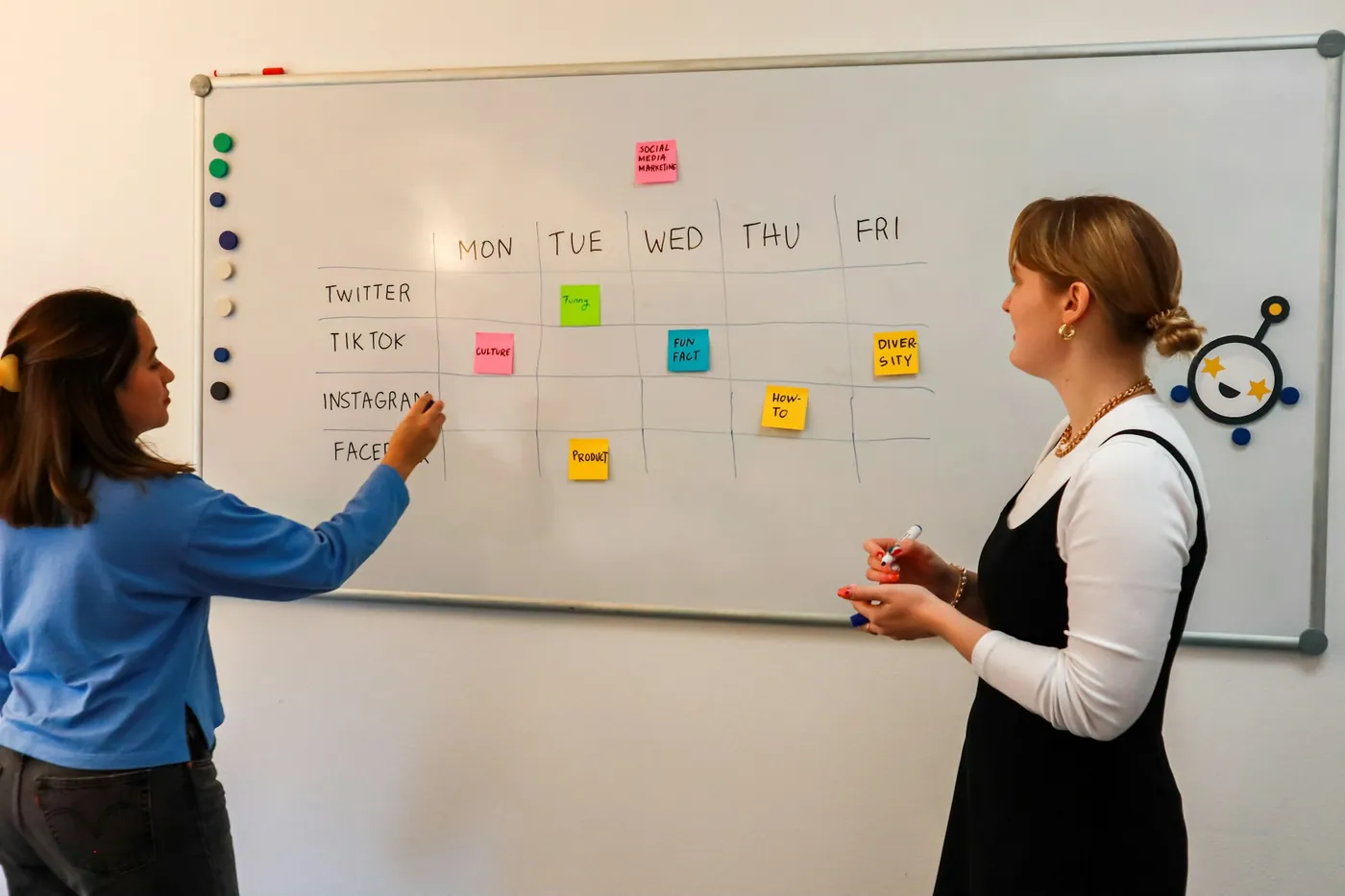
Most visitors who leave aren’t put off by colours. They leave because they can’t tell within a few seconds what you do and whether it’s for them, because the next step isn’t obvious, or because a form asks for too much. These are UX problems, and they’re fixable.
We see them constantly in campaign data. Managing around R5 million a month in paid media shows us exactly where people drop off, which pages convert and which forms get abandoned. That evidence shapes our UX work.
What UX work includes
- Research. Who your visitors are, what they’re trying to do and what competitors offer them.
- Sitemaps and journeys. The pages, the path through them and the job each one does.
- Figma wireframes and prototypes. Clickable designs you can test before anything is built.
- Forms and conversion points. Asking only what sales needs, in the right order, on a phone.
- Web application interfaces. Dashboards, portals and admin screens that staff can use without training.
- Accessibility. Readable text, clear labels, keyboard access and sufficient contrast.
How we work
- Understand the goal. What should a visitor do, and what does the business need from them?
- Review the evidence. Analytics, campaign data, support questions and sales feedback.
- Map the journey. Sitemap and key paths through the site or application.
- Prototype in Figma. Clickable flows on desktop and mobile.
- Review and refine. With you and, where possible, real users.
- Build. We develop the design ourselves, so the details survive.
Designed and built by the same team
The most common way UX goes wrong is the handover. A designer produces beautiful screens, a developer interprets them, and the subtle things that made the design work disappear. Because we design and develop in-house, the person who knows why a form field is there is the same team that builds it.
Common UX fixes that make a real difference
Some improvements come up on almost every site we review:
- A clearer opening: say what you do and who it’s for in the first screen.
- Fewer form fields: remove anything sales doesn’t actually use.
- A visible next step on mobile, without covering the content.
- Navigation in the customer’s language, not internal department names.
- Faster pages, because slow pages lose visitors before they’ve seen anything.
- Trust signals near the decision: real work, real clients and clear contact details.
- Error messages that help, and forms that keep what people typed.
UX for web applications
Software has different UX challenges from websites. Staff use it every day, often under time pressure, so small frustrations add up. When we design dashboards, portals and admin screens, we focus on the most frequent tasks, keep common actions one click away, show the information people need to make a decision on the same screen, and make mistakes easy to undo. Systems like the Suzuki secret shopper platform depend on this: complex data has to become a clear comparison at a glance.
How we know UX worked
Good UX shows up in the numbers. Depending on the project, we look at enquiry or conversion rates on key pages, form completion, how far visitors get through a journey, time to complete common tasks in an application, and the questions customers still have to ask by phone. We measure before and after, so improvements are evidence rather than opinion.
UX principles we stick to
- One page, one job. Especially landing pages.
- Make the next step obvious on every page.
- Ask for less. Every extra form field costs enquiries.
- Design for phones first. Most of your visitors are on one.
- Write for scanning. Clear headings, short paragraphs and plain language.
Estimate your UX work
Try our discovery and technical scoping estimator for journey and prototype work, or the accessibility remediation estimator for existing sites.
UX questions
A few useful answers before you decide.
Can you improve UX without a full redesign?
Do you design web applications as well as websites?
Will we see the design before it's built?
Do you run user testing?
Is accessibility part of your UX work?
Let’s find where you’re losing people
Send us your site and tell us what visitors should be doing. We’ll respond quickly with what we’d look at first.
Keep the right things connected.
Website design, engineered to launch fast and keep working
Figma design, WordPress built the way developers would build it, and direct support after launch. Websites for SMEs, automotive brands, corporates and agencies since 2013.
Paid media managed by people who build the systems behind the leads
Google and Meta campaigns managed in-house, around R5 million a month across finance, automotive, B2B and beauty and health, with reporting that never hides the data.
Website pricing calculator
Design level, pages, features, hosting and care, priced line by line.
Pricing
Ten pricing calculators: one for the full agency service and one for each individual service.
Start a conversation
Tell us what you are working towards. We’ll help you find a practical next step.