
Nero Studio
A catalogue PDF in, a premium brand out
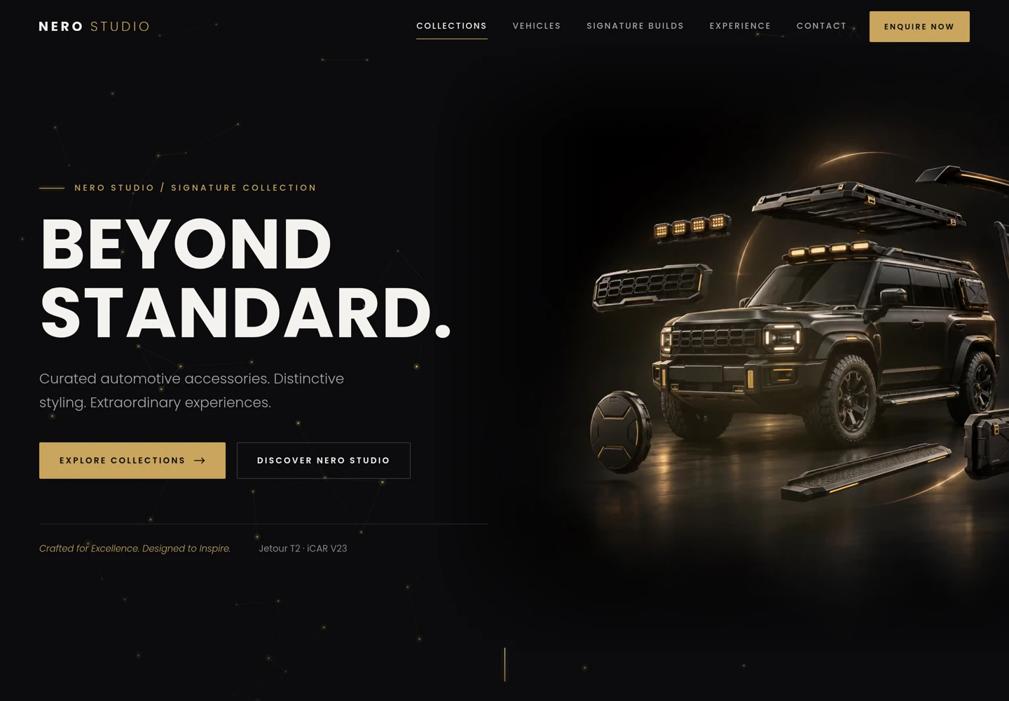
Nero Studio is a new automotive accessories and styling business in Rivonia, Sandton. It came to us with a 24-page Signature Collection 2026 catalogue covering two vehicles, the Jetour T2 and the iCAR V23, and an existing corporate identity. It didn’t have a website, product photography that worked on a dark page, or a clear way to say what it was beyond “we sell parts”.
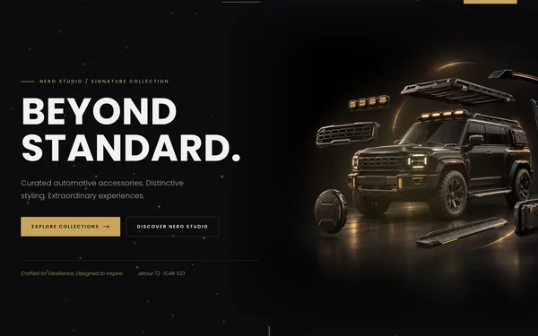
We repositioned it as a premium customisation and lifestyle brand rather than a parts importer, and built a single-page brochure site around that idea: Beyond standard. The site leads with the brand, lets buyers browse by vehicle or collection, and turns every product into a qualified enquiry. Checkout and inventory were deliberately left for later.
The whole thing (strategy, imagery, build, testing and motion design) took a few hours rather than the weeks a traditional build would have taken. How we built it with Claude and ChatGPT has the full workflow.
Six collections instead of a supplier’s categories
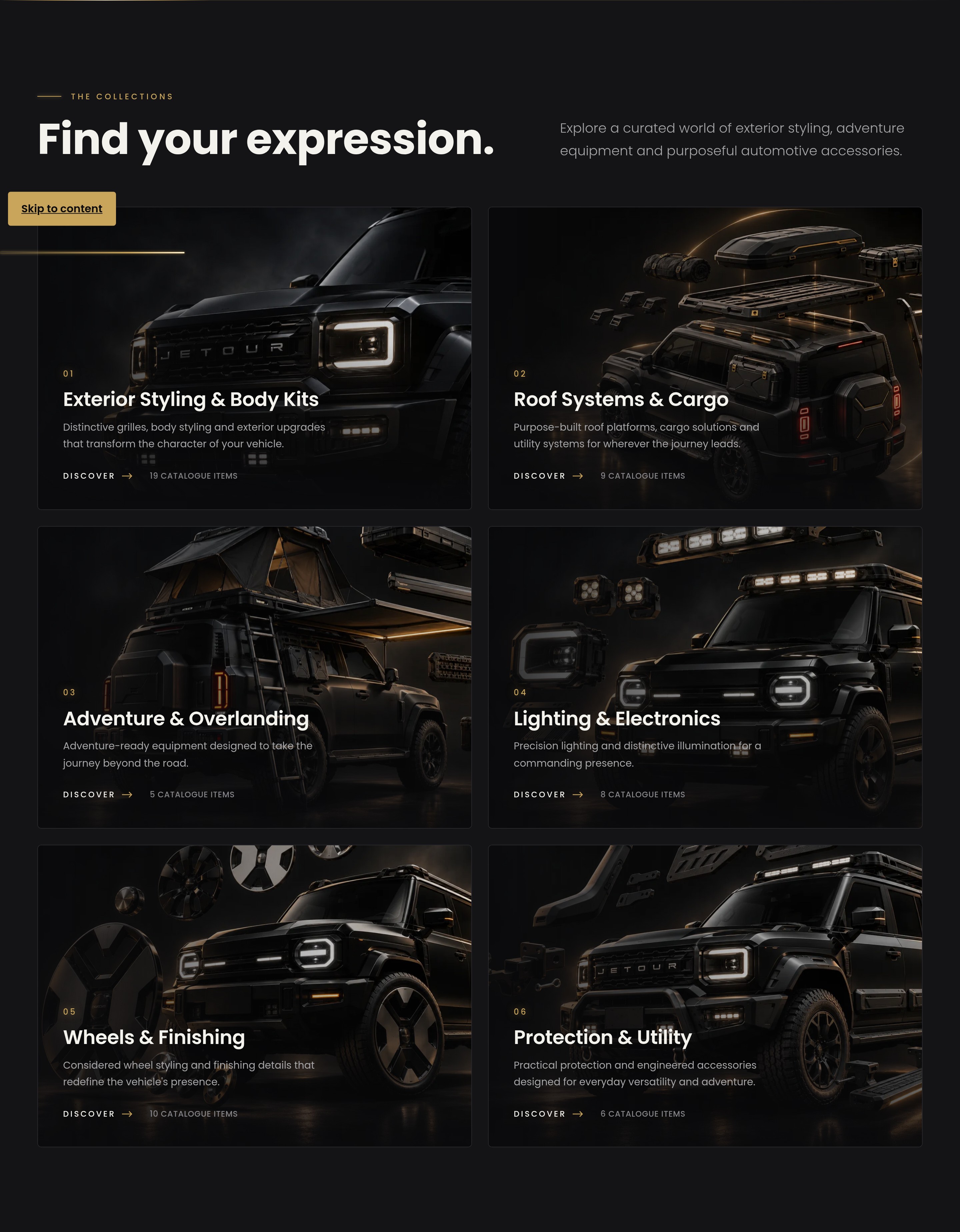
The catalogue was organised the way a supplier thinks. We regrouped 52 products into six collections a buyer would recognise: Exterior Styling & Body Kits, Roof Systems & Cargo, Adventure & Overlanding, Lighting & Electronics, Wheels & Finishing, and Protection & Utility.
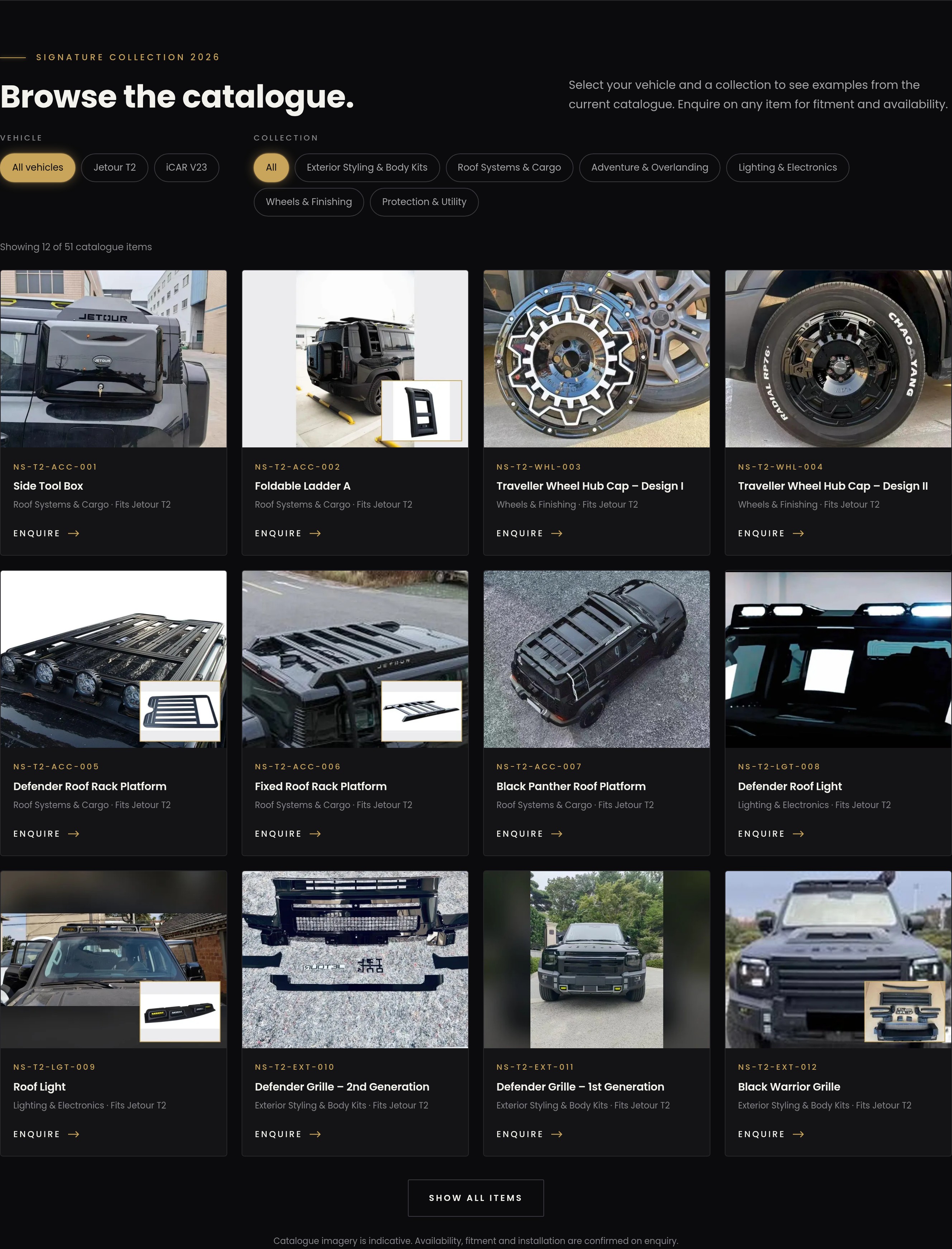
Every product was extracted from the PDF, matched to its SKU and mapped to a vehicle and a collection. A build script turns that into one structured data file, which drives the collection tiles, the vehicle ranges (35 items for the T2, 17 for the V23) and the catalogue grid. When the catalogue changes, the site changes with it. Nobody has to hand-edit 51 product cards.
A catalogue you can filter, and enquiries that arrive pre-filled
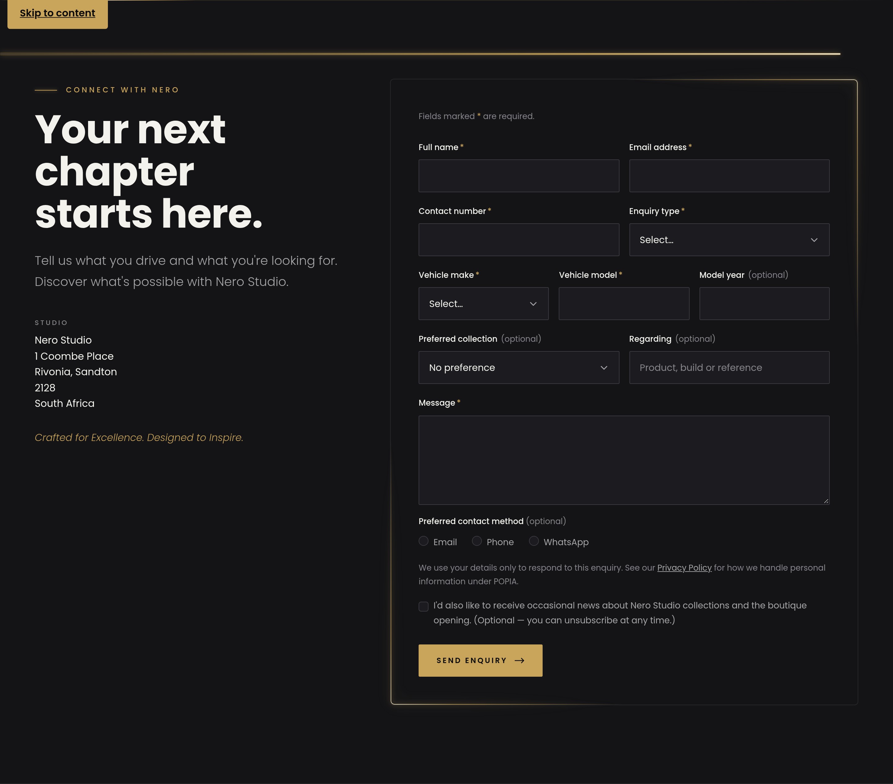
The catalogue section filters by vehicle and by collection, with product codes visible on every card. Clicking “Enquire” on any item jumps to the enquiry form with that product already filled in, together with the buyer’s vehicle and preferred collection. The sales conversation starts with the right part and the right car instead of “I saw something on your website”.
The form has a hidden anti-spam field, a plain-language privacy notice that references POPIA, an unticked marketing opt-in and a configurable endpoint. Fitment and availability are confirmed on enquiry, and the site says so. It doesn’t overpromise on parts that depend on the vehicle.
Imagery that didn’t need a studio shoot
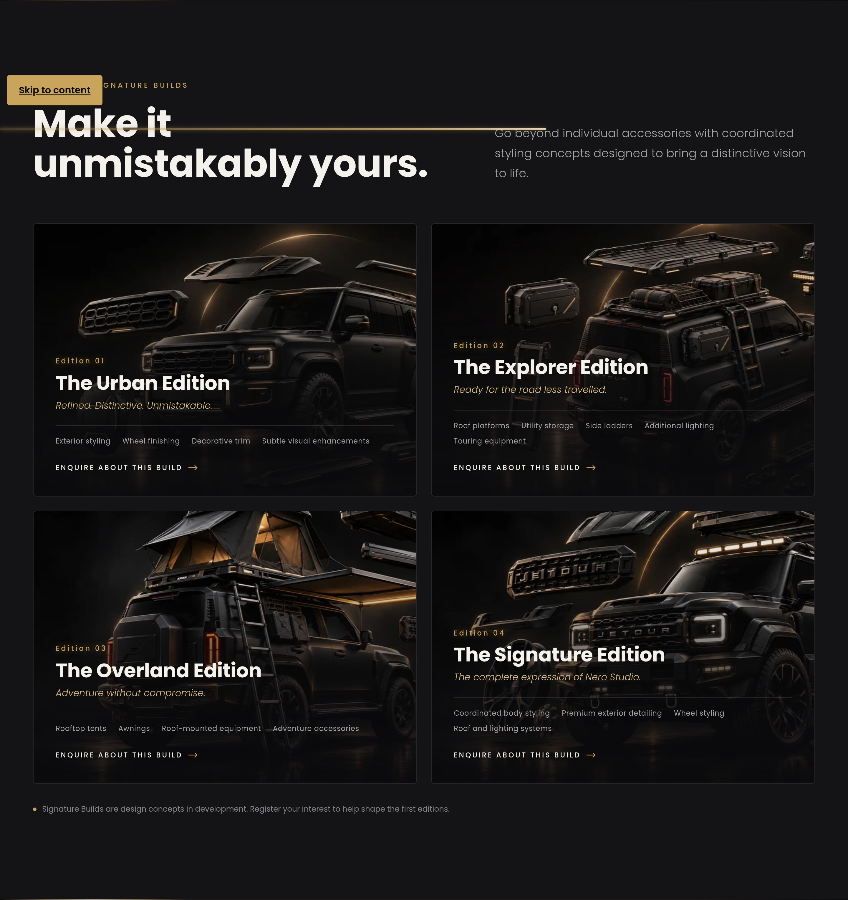
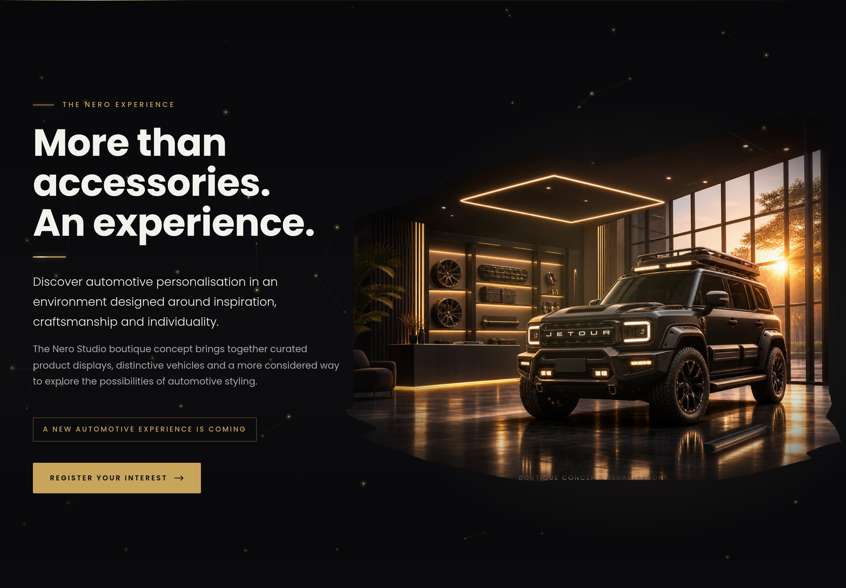
The hero, collection backgrounds, four Signature Build concepts and the boutique showroom are AI-generated, art-directed to one look: matte-black vehicles, dark studio sets, champagne-gold rim light and deliberate negative space on the left for headlines. Each image was composed to work as a website asset rather than as standalone artwork.
We were careful about what those images claim. The Signature Builds (Urban, Explorer, Overland and Signature) are presented as designs in development, with interest registration open. The showroom is captioned as a boutique concept visualisation, so nobody mistakes it for a store they can visit yet.
A page that moves
The client wanted it to feel alive, which meant shimmer and connected dots. We added a cursor-reactive gold constellation behind the hero, neon light that traces card borders and the enquiry form, headings that rise word by word, image wipes, parallax and an occasional glimmer on the “O” of the logo.
Motion is easy to overdo, so it has guard-rails. Everything stays in the brand’s gold. Animations pause when they’re off-screen or the tab is hidden. Visitors who ask their device for reduced motion get a fully static page. We verified it at a steady 60fps with no horizontal scroll at 390, 1440 and 1920 pixels wide.
Built in Astro, and we know every line of it
The site runs on Astro with Bootstrap 5 and custom SCSS design tokens sampled from the catalogue itself. That’s why the gold is #C9A55C and the type is Poppins: we matched the source rather than guessing. Images are served as responsive AVIF and WebP, and the hero dropped from 1.4 MB to between 8 and 64 KB depending on screen size. Canonical URLs, social tags, structured data and a sitemap are in place, and GitHub Actions handle CI and deployment.
The speed came from AI, but the codebase is ours to explain. It isn’t a black box generated in one shot: every section, data file and animation was reviewed, tested in a real browser and fixed where it broke. We can change it, extend it into e-commerce or hand it to another developer without reverse-engineering anything.
What’s in the gallery
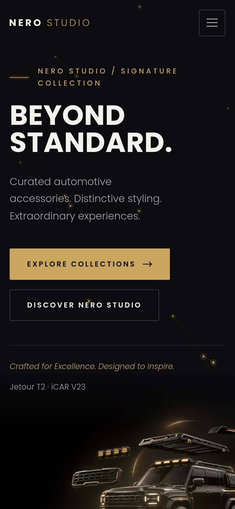
The gallery shows the pre-launch build on desktop and mobile: the full homepage, the six collections, the filterable catalogue, the Signature Build concepts, the boutique section and the enquiry form. The cover is rendered in HTML and CSS around real screenshots.
Read how we built it · Discuss a website like this · Explore website design
Nero Studio
Project gallery.
Open an image and scroll to explore the page. Use the arrow keys to change images and Escape to close.



Keep the right things connected.
ChatGPT as Creative Director, Claude as Build Team: A Website in Hours
How we took an automotive accessories brand from a catalogue PDF to a tested, animated Astro website in a few hours, and why we still understand every line of the code.
Website design, engineered to launch fast and keep working
Figma design, WordPress built the way developers would build it, and direct support after launch. Websites for SMEs, automotive brands, corporates and agencies since 2013.
Digital strategy that connects your website, paid media and SEO
One plan that connects your website, paid media and SEO, written by the team that builds and runs all three.
Start a conversation
Tell us what you are working towards. We’ll help you find a practical next step.